Console software/media boxes and storage cases have a tendency to evolve over the lifespan of a system. We’ve seen evidence of this in the past, in the way that the early Atari VCS titles had a quintessentially 70s style of art on the boxes before evolving to a more arcade cabinet artwork style. Nintendo also started their NES console’s lifespan with a distinctive black box – pixel art style that later evolved to something less formulaic and much more colorful. Even Sega kicked off their Genesis console’s life cycle with a certain style that can be identified by its consistent artwork style and placement of console’s name at the top, title of the game at the bottom (ensuring everyone knew this was a 16-bit game with the subheader) and basic black case spines.

Sega’s Genesis add-on, the Sega CD, also went through a bit of an evolution after its initial release in 1992. The first 20 or so games released for the console in late ’92-early ’93 were available in long cardboard boxes, similar to the boxes that CDs were originally released inside of. These boxes came in different colors and with different art styles depending on the game. Some were released using hand drawn art attempting to represent relevant gameplay (e.g. Wonder Dog, Time Gal, Night Trap) while others utilized promotional photos if the games were based on a license or had FMV worth showing off (e.g. Batman Returns, INXS Make My Video, Sewer Shark).
To top it all off, some of the Sega CD pack-in titles, such as Sol-Feace and Sherlock Holmes Consulting Detective, were packed in the smaller digi-pack style. There aren’t many (did I just list off the only two?) but this throws another wrench into the lack of uniformity that already exists for this system.

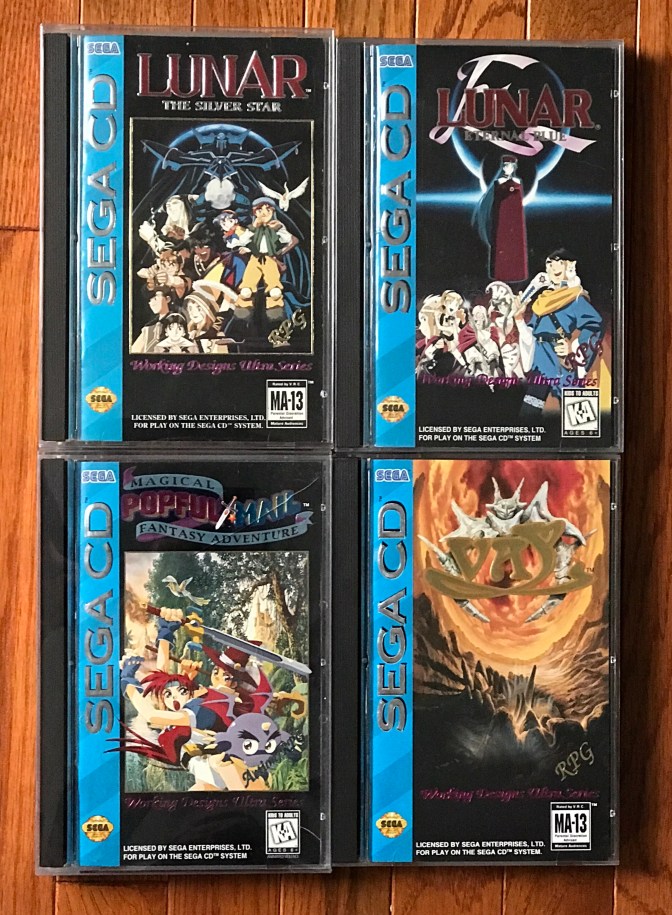
After this initial run of games utilizing the cardboard box style, Sega went a different direction with its Sega CD cases. Starting sometime in mid-1993, Sega CD games were no longer being released in cardboard boxes with generic jewel cases to hold the game and manuals tucked away inside the box. Now they were being sold in stores with hard plastic jewel cases with a alternating light/dark blue striped background strip along the left

hand side of the front stating that this game was for the Sega CD with Sega’s “Official Seal of Quality” noted at the bottom. The case spines would also utilize the blue striped backgrounds, giving these cased Sega CD games a pleasant, uniform appearance.
From a collection standpoint, the taller hard plastic jewel cases last much longer than cardboard although, like the Saturn cases that would follow, the style of plastic used was quite brittle so finding Sega CD cases completely intact, especially at the hinges, isn’t always an easy task. Finding earlier Sega CD games with the cardboard boxes intact can be a somewhat expensive task as well. This is especially true for some of the more sought after early Sega CD games such as Final Fight CD, Night Trap and Time Gal. I personally prefer the blue style game cases over the cardboard ones largely due to the uniformity as well as the fact that blue happens to be my favorite color. Either way, Sega CD did a nice job with their game artwork, with special props going out to the Working Designs team that created the beautiful artwork for their titles (i.e. Lunar I & II, Vay, Popful Mail).