
Do you enjoy the bright blue, color coded Sega CD cases? How about a basic but distinctive black with a splash of a color bar to indicate a genre or style that the NES black box and the TurboGrafx-16 used for their game boxes? Uniformity not your thing? Maybe you preferred the anything goes style and artwork of the Atari 2600? Weirdo. If that is indeed the case, you’ll love the artwork approach that Sega employed for its Genesis system, because it’s all over the map.
Like the Atari 2600 did with their early first party developed game boxes, Sega attempted their own version of uniformity with the appearance of their first party developed game cases right out of the gate. Also like Atari and ultimately, Nintendo, once 3rd party publishers dipped their toes into the 16-bit home console game, the style that Sega started with was no longer utilized. Let’s first take a step back to help explain what exactly it is that we’re talking about.
Like the Master System that preceded it, the Genesis/Mega Drive is a cartridge based system that, for the most part, used hard plastic clam-shells to house the carts and manuals. For this reason, Genesis cases tend to be significantly easier to procure for collectors than their 16-bit brethren (SNES, TG-16) who utilized seemingly disposable cardboard boxes for shipping, displaying & storage purposes.
Besides a sturdy clam-shell case, one other distinctive artwork choice that Sega made was the utilization of a grid-pattern as the basis of its design. Sega’s grid pattern first saw the light of day during the Master System era, as their console box and game cases all had a graph paper like design to them, black lines over a white background. The Genesis console & game box/cases used a similar grid scheme, but they flipped it around by using white lines over a black background. Another notable difference between the Master System and Genesis designs was that Genesis cases had much larger, more detailed and better drawn artwork. Artwork that covered up much of the grid background. This simple improvement was necessary if Sega wanted to be taken seriously as a contender to Nintendo. The Master System game case artwork is notorious for its rudimentary simplicity. Genesis artwork needed a step up in sophistication and competency that the Master System artwork lacked. Mission accomplished.

For the first several years of the existence of the Genesis (approx 1989-1992), games were released using this previously described graphic pattern. This gave all the games a clean, uniform look. Naturally, 3rd party developers were recruited to create high quality and exclusive games for the system and they were either encouraged or simply told that they could deviate from the standard Sega design. Games from publishers such as Namco, Electronic Arts and Konami all initially looked very different from the rest of the Sega titles. The dimensions of the cases were the same, but the colors and designs were distinct and unique to the games themselves.

At some point, around 1993, Sega switched up the style of their first party games and discarded the black and white grid look. They chose to go a bit brighter and finally abandon the grid pattern that they had been using since 1986. Newly released games now had a two-tone red striped background. Apparently Sega convinced a large majority of the 3rd party publishers to follow suit. Games from Konami, Namco, Sony, Interplay, etc. were now releasing titles for the Genesis using the same color scheme as Sega’s first party titles.


Flash forward to 1995. Games developed by Sega were now showing up in stores shipped in cardboard boxes, not plastic clam shells. Huge and important games for the console such as Sonic & Knuckles, Comix Zone, Beyond Oasis, Phantasy Star IV and Shining Force II came in cheap cardboard boxes! After releasing such sturdy and user friendly plastic cases for so many years, one can only assume that the move to cardboard was done in an effort to save money while Sega of North America struggled with sales of the newly launched Saturn console. 25 years later, this decision has a ripple effect on the retro gaming community since these titles are not only highly sought after because of their excellent gameplay but also because they were some of the last A-rated titles released for the console. Combine that demand with an inherently lower supply of complete-in-box games due to the disposable nature of cardboard and you have some of the (not THE) most expensive CIB games available on the system.
I will also briefly touch on what I consider the scourge of my Genesis library. In the mid ’90s, Sega re-released some of their earlier hits in a greatest hits style packaging design that they called “Sega Classic” titles. Instead of just re-releasing the game using their original artwork style, Sega chose to place a smaller photo of the original artwork on a clam shell case with blue background with the words “Sega Classic” in large white font above the picture. This title had larger font than the wording of the game located on the photo! Once you opened the case, the cart and manual looked identical to the original release, but these “Sega Classic” cases really look cheap to me. As if you were buying a bargain basement, knock-off version of Golden Axe or Sonic the Hedgehog. Nintendo committed a similar crime with their “Best” series for the DS, using a picture of the original case artwork inside the larger case artwork. Why? Pointless if you ask me, but I’m only commenting on these decisions as a collector 15-25 years after the fact, not as a marketing team trying to distinguish a value priced game to drum up sales.


So how do you display your Sega Genesis cases? Alphabetically, where color and design schemes be damned? If you display them by developer/publisher, you’ll still have a variety of color and design schemes to work with as many 3rd party publishers eventually adopted Sega’s red box scheme after previously establishing their own. I imagine those that like to display their games based on how the spines look (color, design) will go with the two primary schemes; black/white grid and red striped. The rest likely would be displayed by publisher. It really all depends on how much you value aesthetics vs. functionality, where simply alphabetizing wins out. Regardless of your choice, Genesis games were meant to be played and this system contains some of the best ’90s gaming available. Play it loud, indeed.


This is a constant struggle for me. I reorganize my games several times a year, because I can’t come to a definitive method for organizing them. The struggle is real.
LikeLike
Amen brother. I often just stick to alphabetical which some consider blasphemous.
LikeLike
In Europe we have neither Sega Classic nor cardbox. Grid layout for almost every game, except for third parties videogames. Late videogames boxes were all light blue colored. I prefer the first one because it was Michele more distinctive and more colorful. Blue color flattened the artwork on the cover.
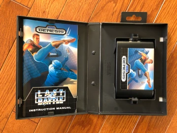
Last Battle really sucks, I printed the japanese one and covered the ugly original.
Cover artwork is underrated, but since Atari VCS is one of the first factors in customer decisions. When elementary graphics let the imagination do the hard work, artwork was the catalyst of videogamers imagery.
LikeLike
Interesting! Definitely didn’t know what the differences between Pal Mega Drive vs NRSC Genesis artwork and case structure was like. Thanks for the education!
LikeLike
I may be biased from my past but I think the PAL blue cases are much nicer than the NTSC red cases. It’s blue like SEGA and it ties in nicely with the NTSC Sega CD cases.
LikeLiked by 1 person