Video game art. Some game companies get it right. Some game companies do not. Atari got it right. They knew that the graphics within the 2600 line of games themselves were often lackluster, or at least, could only go so far with the software and hardware limitations at the time. They filled in that gap by creating lavishly drawn box and label art to represent the gameplay & excite potential consumers. This allowed players to imagine that the games they were enjoying were the elaborate and colorful environments presented on the boxes and cartridges themselves. Atari also employed talented artists to pull off this illusion. These images have become so revered by fans of the console that an entire book, Tim Lapetino’s “Art of Atari”, is dedicated to glorifying & capturing the amazing artistic achievements from this era.
Nintendo took the opposite approach when ushering in their new console, the Nintendo Entertainment System, in 1985 by creating game boxes and labels with images that closely mirror the actual graphics and gameplay found within the cartridges. It was a shrewd but effective move that built goodwill with early adopters of the system and its set of “Black Box” titles. These early artistic efforts are now considered iconic images from the NES era, which I highlighted last month in my “Black Box Art” series.
As I mentioned at the beginning of this post, some companies did not get the fine art of game artwork right, or at the very least they tried something different only to fail in the eyes of many. One easy example is the Sega Master System’s game artwork. From an aesthetic experience, seeing the game boxes, all uniform in their grid patterns, is pleasing. If you take a closer look at the drawings used on these clam shell cases, you’ll often see simple, crude drawings that rarely reflect what is actually going on inside the games themselves and in some cases, only cause confusion. A disembodied head being held in a head-lock by a headless wrestler? Ok, Sega….can you explain why decapitation is considered a crucial part of a wrestling game? No? You just thought it was a funny image?
So where does the Turbografx-16 fall into this spectrum? I’d say somewhere in the middle, maybe leaning towards the “less than impressive” side of things. First, it should be noted that the source artwork for many of the Turbografx-16 games, the Japanese PC-Engine, was generally amazing. The PC Engine titles contained great cover art with lots of relevant detail that inspired prospective buyers to pick up and play the games. When Hudson Soft transferred over responsibility for marketing the PC Engine/TG-16 in North America to NEC, well…..lets just say that NEC couldn’t leave well enough alone. Instead of making minor tweaks and adding some English text, they completely re-did/re-imagined the game’s artwork to often times disastrous effect. If I’m just looking at my own personal library of TG-16 titles and what pops out at me as being “less than impressive”, I’m going to point out the following.
Dungeon Explorer

This is an easy target as the drawing looks like some 8th grader’s homeroom doodling. The hero has his back to us with legs that appear too short for his wide shouldered body while his left arm is doing God knows what. Why are the woman and the robed character that are standing on the cliff glowing? Are they radioactive? “Dungeon Explorer” art is terribly bland and questionably executed for what is actually a pretty good game.
Galaga ’90

This one is confusing. The artwork appears to be a dull photocopy of a picture. Like someone had a nice glossy photo representing the game and took it to Kinkos, made color prints on low quality paper then xeroxed them over and over to achieve that blurry, washed out, low quality look. Such a missed opportunity for an amazingly fun update to the “Galaga” brand.
Blazing Lazers
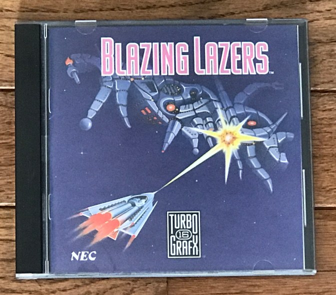
One of the best & exciting, fast paced shooters on the system gets the super boring artwork treatment. “Ooh look, a standard triangular shaped spaceship shooting a boring yellow laser gun at a arachnid looking enemy space ship that doesn’t even appear to be fighting back. Way to go space bully!”
Legendary Axe II
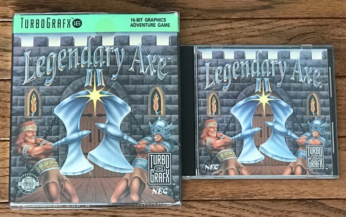
Alligator armed warriors with gleaming, pearly white teeth smash enormous axes (not to be confused with a sword fight) on a drawbridge in front of a castle entrance. I don’t recall doing this in the game at any point but I do get that the two axes shown front and center are supposed to be visual reminder this is a sequel. Damn, those are ugly looking warriors though.
J.J. & Jeff
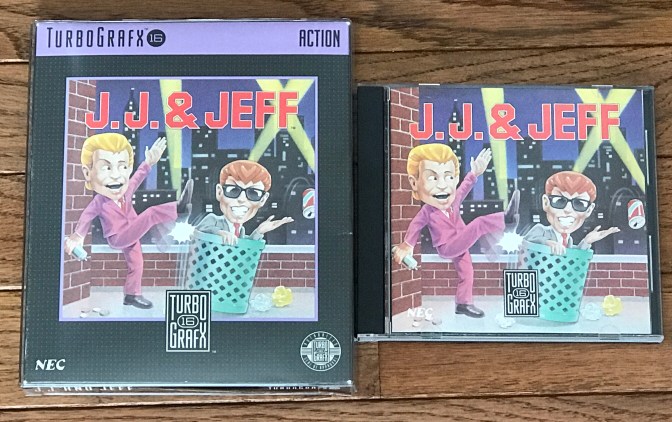
A completely watered down version of the Japanese’s subversive platformer gets suitably watered down cover art. “J.J. & Jeff” come off as slimy used car salesmen with their suits, slicked back hair and douchey “sunglasses at night” looks. One of them (who cares which one is which) is kicking a trash can that the other is sitting in while he creepily grins at us as he tosses a soda can to the ground. Are they friends? Enemies? Litterbugs? What is this game? Based on the artwork, you would have no idea and likely would have no inclination to care.
There are quite a few other “less than impressive” artwork examples in the Turbografx-16 library and this is only a very small example. My last post in this series will highlight five games from my collection where I thought NEC (or whoever they hired out to work on the art) actually got it right.
