
The Jaguar, Atari’s final console released in 1993, was not a success. This is clear and unquestionable. This does NOT mean there are no games worth playing and it does NOT mean that the Jaguar is not worth owning and collecting for. Aesthetically speaking, I’m a fan of the Jaguar. I’m a fan of the console’s sleek black look. I’m a fan of the black and red color scheme. I’m even a fan of the Jaguar logo with it’s extended “R” and cat claw mark. Sure, the controllers were a miss and if Atari would have packaged a traditional 4-6 button controller similar in style to what Nintendo, Sega and 3DO consoles were packaged with, it would have been a huge step up from the bulky, boxy controllers available for the Jaguar. However, in my opinion, the Atari Jaguar was an overall winner in the early to mid-90s video game console pageant circuit. Atari Jaguar from Sunnyvale, California….get ready for your close-up!

Kicking off this microscopic critique of all things Jaguar is the box and label art. Jaguar game boxes and label art are very uniform in appearance and style, something that other consoles of the era could not always achieve thanks in part to a heavy reliance on 3rd party titles. While a uniform appearance isn’t necessarily a big factor in terms of aesthetic appeal for some people, I will always be partial to this approach thanks to the NES Black Box titles that introduced me to home console gaming back in 1986. These were my formative video gaming years and even at a young age, I loved how the NES Black Box games looked on store shelves and more importantly, in my own collection. The Tubrografx-16 & Sega Master System also utilized a uniform style for their games and I find myself drawn towards those consoles as well. Coincidence? Maybe, but probably not. If one can put aside the negativity and ridicule that has surrounded the Jaguar for the last 20+ years and simply look at what Atari was offering consumers when the console was still fresh, new and (somewhat) promising, you might actually see what I see when I look at Jaguar games.

All of the Jaguar cartridge boxes start off with a basic black background. This matches the console’s color and the console box as well. If one is looking at Jaguar game boxes lined up on a shelf like books, you will notice they have a very uniform appearance across the board. Along the right hand side of the game box is the word “Atari” in white with the Atari logo in front. Then printed in red, perpendicular to the Atari name/logo, is the word “Jaguar” with “64-Bit” clearly written underneath in yellow circles. The cat clawed logo for “Jaguar” is written in that familiar and consistent font across all games and console boxes. So far, so good.
The same “Atari” and “Jaguar” logos are used on each of the box fronts as well. Typically, the “Atari” name and logo can be found along the left side often just above the ESRB rating, if the game was released after ratings became mandatory. If not found along the left side of the box front, the “Atari” logo can be found in the lower right just above the “Jaguar” logo. The “Jaguar” and “64-Bit” logos are consistently found in the lower right hand corner of the game boxes. The phrase “Interactive Multimedia Cartridge” can be found at the very bottom of each box front. This phrase is just an overly technical way of saying “video game” but that doesn’t sound impressive and Atari was all about trying to impress the consumer with fancy terminology and fuzzy math.
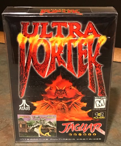
The primary artwork used for each Jaguar game was typically well drawn (unlike Master System or Turbografx art), colorful and fairly representative of the gameplay that could be found within the cartridges. The primary graphic took up the majority of the box not used for the Atari and Jaguar logos (smart use of space). ESRB rating (when applicable), third party developer logos (also when applicable) and a logo indicating if the game had the ability to be a multi-player title could also be found on the game boxes. All of this is pertinent information that should be located front and center. The title of the game was typically printed along the upper third of the box utilizing a variety of fonts and colors. I like how these game titles weren’t identically printed in a boring block letter font or always the same size. For example, the title for “Ultra Vortek” is printed in huge size font, taking up even more space than the drawing found underneath it. On the opposite end of the spectrum, the title for “Alien Vs. Predator” is printed much smaller along the top of the box, leaving more space for the drawing of the Predator and the Alien battling it out. The art team at Atari knew that a large, detailed photo of the game’s two biggest stars would sell the game better than any other marketing scheme could dream up.

The lower left hand corner of the box fronts included a screen shot from the actual game, which is something that had never really been done before. Typically screen shots were relegated to the backs of video game boxes, but Atari must have been so confident that the visual quality of their games would be a strong selling point (it wasn’t) that they felt emboldened to show them off front and (left of) center. Atari didn’t stop there, however. They included an additional 4 screenshots shown on the back of each box for a total of 5 screen shots available to prospective buyers to critique when deciding which game to buy. The lower half of the back of the box is used for the game descriptions and depending on when the game was manufactured, these descriptions can be found in several languages; English, German and French. In order to fit the game descriptions in three different languages on the back half of a video game box means that the print font is quite small and very brief. The first wave of games released in late 1993 and early 1994 did not include a multi-lingual boxes or manuals but at some point in 1994, Atari must have decided it would be more cost effective to print manuals in several languages so they could print one run and pull from this print lot in order to fulfill orders for a variety of countries in North America and Europe. “Tempest 2000” is one of those odd-ball games that does not include a multi-lingual box but does include a multi-lingual manual. All of the other games that I own are either one (English only) or the other (multi-lingual only). “Wolfenstein 3D” was released in August of 1994 and it did not include multiple languages on the box or manual, however Atari released a slew of games in late 1994, all with multiple languages so it was clear that sometime in late 1994 the decision was made. This neither enhances or detracts from the boxes however it does make the manuals unnecessarily thick.

Speaking of manuals, the ones that were shipped with the Jaguar cartridges were some of least visually impressive available at the time. Printed in plain black and white, they are reminiscent to the later Majesco produced Genesis game manuals in their sheer blandness. Most of the manuals were printed on glossy paper so at least the quality was high but otherwise, they were unremarkable.


Finally, I will touch on the cartridges themselves. They are black, have full color labels and are of sturdy quality. They are most similar to Genesis carts in color, size and shape with one distinct difference. Atari Jaguar carts have an long, circular plastic tube with a distinct curve running across the tops of the carts. In essence, this acts as a sort of handle that makes it easier to insert and withdraw cartridges from the Jaguar console. This is good. What isn’t so good is the fact that these “handles” do not allow for cartridge spine labels. When lining up your loose carts on a shelf, there is no way to know which cart is what game so many Jaguar collectors have resorted to making their own spine labels. My guess is that most of us would trade the handle for a spine label when it’s all said and done. Atari tried to do something different but it wasn’t necessary.
That’s my take on the Atari Jaguar’s aesthetically pleasing game artwork and overall packaging. I like what they did for the most part in terms of the art style for the console and game boxes and the cartridges themselves. The manuals were unimpressive but not entirely negative, just bland and unnecessarily bulky. Sure the controllers are widely panned and the games, well, they have their merits but even a fan of the Jaguar such as myself can admit that as a whole, most are mediocre. Atari may not have done a lot right with their roll-out of the ill fated Jag, but at least their art department turned in some stellar work. Kudos!
